Heloa’s Illustration Kit Optimization
Heloa helps parents better understand their children’s health and development through simple, trustworthy guidance. Illustrations play a central role in this mission—turning complex medical information into clear, accessible visuals.
As one of my first projects at Heloa, I took on the challenge of evolving our illustration kit. Once a comprehensive library empowering anyone on the team to create on-brand content, it had grown into a powerful but heavy system that needed streamlining.
We reimagined the entire kit, making it 15× lighter with AI-powered plugins.
The project includes the system redesign, AI integration, Design optimization, and workflow automation.
-
Discipline: Design Ops · Figma System Architecture · AI-Assisted Plugin Development · Workflow Automation · Brand Systems · Cross-Team Collaboration / Client: Heloa / Sector: Tech
Key outcomes:
Reduced file size and maintenance load by 15× (from 15 variants to 1).
Built custom Figma plugins using AI-assisted coding (Claude) for automated color and stroke management.
Streamlined cross-functional workflows between Design, Marketing, and Product teams.
Improved brand consistency and non-designer usability with intelligent automation and simplified logic systems.
Fully documented system logic and hierarchy for long-term maintainability.
The Hidden Weight of Flexibility
The kit’s greatest strength—its flexibility—was also its biggest problem. We had built it to cover every possible scenario, but that versatility came at a cost: complexity, duplication, and sluggish performance.

The Color Conundrum
Heloa’s visual identity includes over ten color families, each with multiple shades. It gives warmth and clarity to our health content—but maintaining this system in Figma was challenging. Due to Figma’s pricing limitations, we could only use four color modes. Our workaround involved three separate shade systems, which users had to switch between manually.
The result? Confusion. Non-designers struggled to remember which colors belonged to which type. Everyday tasks slowed down with questions like, “Was that violet in warm, cold, or neutral?”

The Stroke Thickness Spiral
Like many design systems, we used multiple illustration sizes—XS to XL—each requiring a unique stroke thickness to stay visually consistent. To make assets plug-and-play, we had flattened all strokes, which meant creating separate versions for every size and every color type.
The math was painful:
3 shade types × 5 stroke thicknesses = 15 versions per illustration.
Every new illustration meant 15 variants. The Figma file became enormous—slow to load, difficult to update, and frustrating for everyone.
Rethinking the System
We didn’t need a patch. We needed a redesign. The goal: keep flexibility, eliminate redundancy.
Starting with Colors
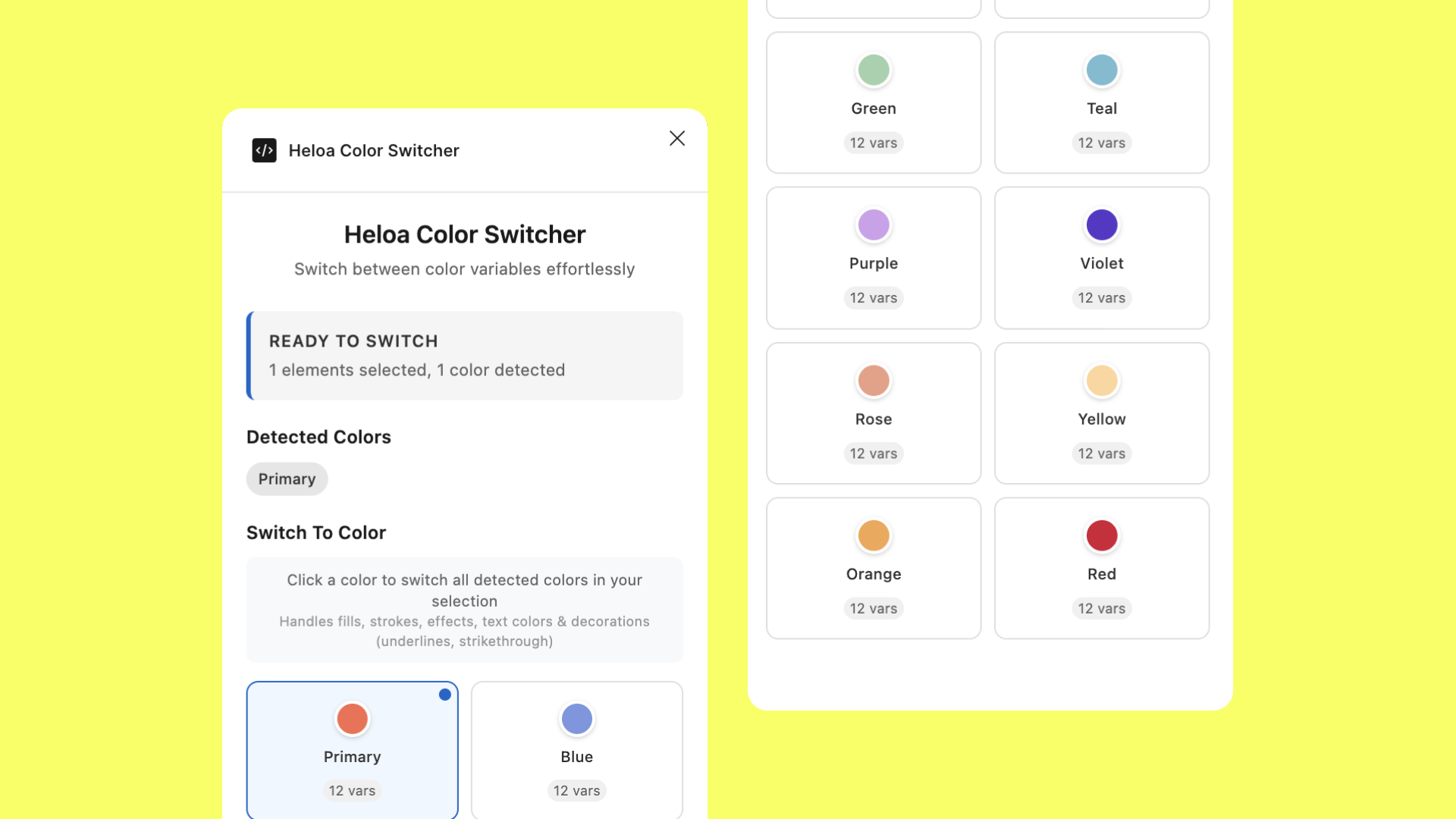
The color issue had the widest impact—it affected not only illustrations but also decks, social assets, and marketing materials. That’s when Gautier suggested building our own Figma plugin.
With Claude’s help, we created a custom color plugin tailored to Heloa’s system. Instead of manually switching shade types, the plugin automatically applied the right colors based on predefined logic.
We restructured our entire palette around this system, replacing the old three-type structure with a single source of truth. Color application became instant—accurate, automatic, and consistent across every asset.
The Bold Stroke Solution
Next came the stroke issue. My first instinct was to un-flatten everything—to bring back editable vector strokes. But consistency across sizes remained a challenge. Initially, I explored using Figma’s string variables to scale strokes based on frame size, but the manual configuration it required made it impractical for non-designers.
Then it clicked: if we could build a plugin for colors, why not one for strokes?
Building “Smart Strokes”

Finding the Formula
I started by asking a simple question: What determines the right stroke thickness? After analyzing our illustrations, I found the answer—the character’s head width.
Head width became our anchor, allowing stroke thickness to scale naturally across age groups and perspectives.
But real-world compositions are rarely uniform. A single scene might include an adult holding a baby or a toddler playing with siblings. We needed a hierarchy to decide which element defined the stroke scale.
The Priority System
We established three rules:
Age priority: adult → kid → toddler → baby
View priority: front view takes precedence over side view
Size priority: when equal, the largest element wins
With this logic, the plugin could analyze complex compositions and apply consistent strokes automatically.
Special Cases
We built fallbacks for social media and print, allowing the plugin to calculate strokes based on frame dimensions when no characters were present.
How “Smart Strokes” Works
When a user runs the plugin, it scans layer names for identifiers like “adult/head/front” or “baby/head/side,” applies our formulas, and adjusts stroke weights dynamically.
Front views use a base multiplier of 0.025 (or 0.02 for finer details).
Each age group applies a scale factor (Adults: 1.0 → Babies: 1.95).
Side views adjust automatically for perspective differences.
Designers don’t need to memorize numbers—just follow naming conventions and click Default Strokes or Finer.
For transparency, a debug mode displays how the plugin calculated each result, making onboarding and maintenance easier.
The Results: Lighter, Faster, Smarter
The transformation was immediate. The Figma file went from 15 versions of each illustration to just one. Performance improved dramatically—no more minutes-long loading times.
Designers regained speed and focus. Non-designers could confidently create visuals without technical friction. And most importantly, brand consistency became automatic—not an afterthought.

Before (above), After (below)
Lessons Learned: AI as an Assistant
Start with the biggest pain point.
Tackling colors first impacted the most people and validated the plugin approach early.Don’t be afraid to break things.
Unflattening assets felt risky, but true improvement often requires dismantling what “works.”AI tools are creative multipliers.
Using Claude as a coding assistant accelerated experimentation and made plugin development accessible to non-engineers.Design systems should evolve.
The original kit wasn’t wrong—it had simply outgrown its context. Design systems are living tools, not static templates.Document for the future.
We didn’t just record how the system works, but why. That reasoning will guide whoever maintains it next.
