How We Made Our Illustration Kit 15x Lighter with AI-Powered Plugins

At Heloa, illustrations aren't just decorative elements—they're a core part of how we communicate with parents about their children's health and development. When you're explaining complex medical concepts in simple terms, the right illustration can make all the difference between confusion and clarity.
Our illustration kit was already a point of pride. We had built a comprehensive library of pre-composed assets that allowed anyone on the team, not just designers, to create beautiful, on-brand content. Need to show a baby's development? A toddler's milestone? An adult's wellness journey? Everything was there, ready to use.
But as one of my first missions at Heloa, I discovered that our beloved illustration kit had grown into something of a beautiful monster. It was time to evolve.
And this is how we made our illustration kit 15x lighter with AI-powered plugins.
The Hidden Weight of Flexibility
The kit's strength was also its weakness. We had designed it to be incredibly flexible, anticipating every possible use case. But that flexibility came at a significant cost.
The Color Conundrum
Heloa's brand includes more than ten distinct color types, each with multiple shades—a rich palette that brings warmth and clarity to our health content. However, we faced a budgeting constraint: Figma's pricing structure meant we couldn't use more than four color modes. Our solution at the time was to organize colors into three different shade types, which users had to switch between manually.
The problem? Nobody could remember which colors belonged to which type. Non-designers found themselves clicking through color types like they were playing a guessing game. "Was that violet in cold, warm, or the third type?" became a daily question that slowed down everyone's workflow.

“Nobody could remember which colors belonged to which type.”
The Stroke Thickness Spiral
The second issue was more insidious. Like many design systems, we had created illustrations in multiple sizes—think of how you might design icons in small, medium, and large versions. But we took it further: XS, S, M, L, and XL. Each size needed different stroke thicknesses to maintain visual consistency.
Here's where things got complicated. To make the kit truly plug-and-play, we had flattened all the strokes. This meant every illustration asset had to exist in multiple versions—one for each size. But we also had those three color shade types to account for.

The math was brutal: 3 shade types × 5 stroke thicknesses = 15 versions of every single illustration.
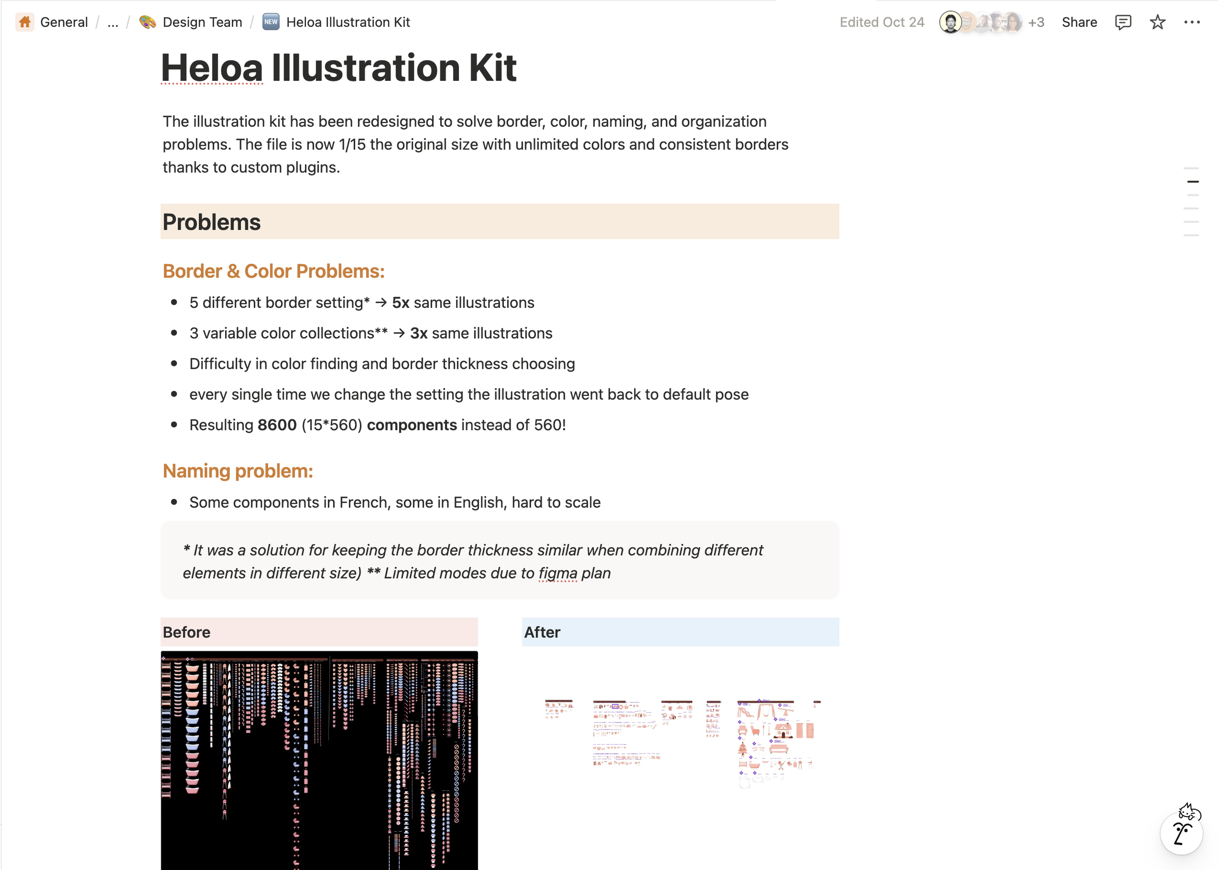
Adding a new illustration meant creating 15 variants. The Figma file had ballooned to a size where simply moving between pages took minutes. Our beautiful, user-friendly kit had become a slow, unwieldy beast that was getting harder to maintain with each new asset.

Illustration Kit (BEFORE)
“Our beautiful, user-friendly kit had become a slow, unwieldy beast”
Who is GAWON LEE?
Rethinking the System
We needed a fundamental rethink, not just incremental improvements. The question was: how do you maintain flexibility while dramatically reducing complexity?
Starting with Colors
We tackled colors first. The color issue was affecting not just illustrations but all our other design assets—social media templates, presentation decks, everything. It was the more urgent problem with the widest impact.
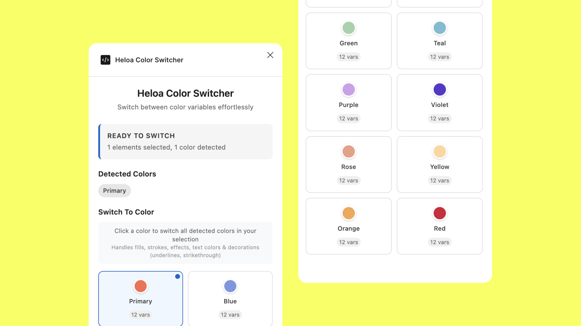
That's when Gautier had an idea: what if we built our own plugin? With Claude's help, we could create a tool specifically designed for Heloa's color system. He prototyped it quickly, testing with our social media templates. The concept was simple but powerful—instead of manually switching between shade types, the plugin would intelligently apply the right colors based on clear rules we defined.
Once we saw it working, we restructured our entire color palette to match the plugin's logic. The three-shade-type system disappeared. In its place: one source of truth, accessible through a single click.
The Bold Stroke Solution
With the color problem solved, I turned my attention to strokes. My first instinct was to un-flatten everything—to keep strokes as editable vectors rather than baked-in shapes. But how would we maintain consistency?
I initially considered using Figma's string variables, which could adjust based on frame size. But the limitations became apparent quickly. Non-designers would need to manually select the right thickness every time, or we'd have to manually configure every frame in advance. Neither option was scalable.
Then it clicked. If we could build a custom plugin for colors, why not build one for strokes?
Building “Smart Strokes”
Finding the Formula
I started with the fundamental question: what determines the "right" stroke thickness for any given illustration? After analyzing our existing assets, I found the answer in an unlikely place—the width of the character's head.
The head width became our anchor point. From there, I could calculate appropriate stroke thicknesses that would scale naturally across different age groups and perspectives.
But the real world isn't always that clean. What happens when a single composition includes multiple characters—an adult holding a baby, or a toddler playing with older siblings?
The Priority System
This led to the development of our priority hierarchy. The plugin needed to be smart enough to analyze a complex composition and determine which element should set the stroke standard for the entire scene.
We established a clear priority order:
Age groups matter: adult trumps kid, kid trumps toddler, toddler trumps baby
View angles matter: front views take precedence over side views
Size matters as a tiebreaker: when all else is equal, the largest element wins
This meant a single illustration could contain characters of different ages, but the plugin would intelligently determine the dominant reference and apply consistent strokes throughout.
Special Cases
Then there were the edge cases—those real-world scenarios that don't fit neat categories. Social media assets, for instance, needed to work at very specific dimensions. Printed materials had their own requirements.
For these situations, we added frame-based calculation as a fallback. In these cases, the plugin would detect frame dimensions of the visual first and apply predetermined values that we knew worked well for common formats like Instagram posts or print flyers.
How Smart Stroke Works

The plugin we built operates on a smart hierarchy system. When you select an illustration and run it, here's what happens behind the scenes:
First, it scans the layer structure looking for age group patterns in the naming—things like "adult/head/front" or "baby/head/side". These naming conventions aren't arbitrary; they're how the plugin understands what it's looking at.
Once it finds these markers, it applies our carefully calculated formulas. For front views, we use a base multiplier of 0.025 for the default thickness (or 0.02 for finer details). But that's just the starting point. The plugin then scales this based on the age group. Baby characters get a scale factor of 1.95, making their strokes nearly twice as thick as adults. Toddlers get 1.62, kids get 1.33, and adults are the baseline at 1.0.
Side views use different multipliers because the visible head width changes with the angle. The math adjusts automatically—a baby side view might get a stroke that's 83% thicker than its front view counterpart.
The beauty of this system is that designers don't need to remember any of these numbers. They just need to follow our naming conventions, select their illustration, and click either "Default Strokes" or "Finer" based on the level of detail they're working with. The plugin handles the rest.
For debugging and transparency, we included a debug mode that shows exactly what the plugin detected and how it calculated the final values. This proved invaluable during development and continues to help when training new team members.
The Results: More Than Just Numbers


When we deployed the new system, the impact was immediate and dramatic. The Figma file went from a bloated behemoth to a nimble tool. We're not exaggerating when we say it's 15 times lighter—we literally went from 15 versions of each illustration to just one.
But the real victory wasn't measured in megabytes. It was measured in time and frustration saved.
Designers no longer wait minutes for pages to load. They're not clicking through color shade types or maintaining parallel versions of the same asset. When we need to add a new illustration, it's a single asset, not a multiplication problem.
Non-designers on the team—account executives, marketers, even medical experts building educational materials—can now work with the illustration kit confidently. They don't need to understand the intricacies of stroke weights or color systems. They select what they need, run the plugin, and get professional results.
Perhaps most importantly, maintaining brand consistency became easier, not harder. When you have 15 versions of an illustration, it's easy for inconsistencies to creep in. With one source of truth and automated styling, consistency is built into the system.
“We literally went from 15 versions of each illustration to just one.”
About Gawon’s projects
Lessons Learned: AI as an Assistant
This journey taught us several valuable lessons about modern design systems and how we could include AI effectively.
How I documented this project (Notion)
#1 Start with the Biggest Pain Point
We could have tackled strokes first, but starting with colors was the right choice. It affected more people and more assets. That early win built momentum and validated the plugin approach, making the stroke project easier to justify and execute.
#2 Don't Be Afraid to Break Things
Un-flattening all those strokes felt risky. We had invested significant time in creating those flattened assets. But sometimes improvement requires destruction. The old system worked, but "working" isn't the same as "optimal."
#3 AI Tools Are Creative Multipliers
Claude was a valuable coding assistant in this project. When Gautier was building the color plugin, he could iterate rapidly because he could explain the problem in plain language and get working code back. When I was developing Smart Stroke, I could test different calculation approaches quickly, asking Claude to help implement variations of the formula.
This changed the nature of what was possible. Neither Gautier nor I are plugin developers by primary training, but we could build professional-grade tools for our team because AI made the technical implementation accessible.
#4 Design Systems Should Evolve
The original illustration kit wasn't bad—it was actually quite good for its time. But design systems aren't meant to be static monuments. They are living tools that should grow and change with your team's needs and the available technology. Recognizing when to evolve is as important as the evolution itself.
#5 Document with Future Maintainers in Mind
As we built these plugins, we documented not just how to use them, but why they work the way they do. The formulas, the priority system, the special cases—all of it is explained. This matters because design systems outlive their creators. Someone else will maintain these tools someday, and they'll need to understand the reasoning behind the decisions.
“Someone else will maintain these tools someday, and they'll need to understand the reasoning behind the decisions.”
Looking Forward
The illustration kit transformation is complete, but it's not finished—if that makes sense. We've built a foundation that can grow with Heloa as we continue to support parents through their journey.
For other design teams facing similar challenges—bloated component libraries, multiplication of variants, maintenance headaches—our experience suggests a clear path forward. Look for the pain points that affect the most people. Don't be afraid to rebuild rather than patch. And consider whether AI-powered custom tools might solve your specific problems better than general-purpose solutions.
Gawon LEE is a Multidisciplinary Graphic Designer with 5+ years of experience based in Paris and Seoul. Specialized in brand design, illustration, and editorial design, he is striving to become a multinational designer with a global reach. For inquiries or more information, please contact gawon.xyz@gmail.com.